About Cards
Cards display on the Home page and link to the card and to content pages
associated with the card. A card acts as a container for similar content;
much in the same way a folder acts as a container for similar files. For
example: You can create a Retirement card that includes content pages
for Retirement Plans and a Retirement Calculator.
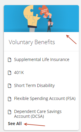
On the Home page, the card image, title and See All text link
to the card summary. Links with icons, go to the associated content page.
Only the top five content pages on the card summary display in the card
on the Home page. You can reorder the content on the card from the card
summary.
Custom cards also display in the left navigation.
Card Types
You add cards to your site from the Home page. The steps for adding
a card differ based on the card type and if you are adding
an existing card from the content library or copying
a card from the library.
There are four types of cards:
Custom
– a card where the content and design is custom to your needs.
Newsfeed
– a newsfeed card displays articles distributed via an RSS feed.
Benefit
Plan – this card displays your benefit plans. If your organization
has a BenefitPoint account, you can integrate with and display your
BenefitPoint plans. You can also create a custom benefit plan.
App cards
– if you activate an app via the Admin dashboard, a card displays
providing users access to the app.
Once a card is added, it is not visible to the user until you make the
card active. You can also make the card public, which allows the card
and content to be viewed by guest users without logging in. These toggles
are located in the Card header.
Edit a Card
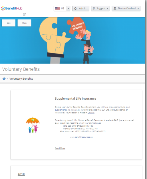
The Card Summary includes a header and content page or file/link sections.
To edit a card:
Click on the card header or See
All to view the card.

The Card displays.

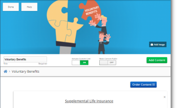
Click Edit. You
can now make changes to the card.

Click Add Image
to change the image. See Change
Image
You can edit the Title.
Click on the Activate Custom
Card toggle to make the card viewable to users (on) or
to hide the card from users (off).
Click on the Make
Content Public toggle to make the card viewable to both
guest and logged in users (on) or to make the card viewable to only
users who log in (off).
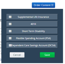
Click Order Content
to change the order of the content pages on the card. The change order
screen displays.

Drag and drop the pages to the order needed and then click Save.
You can delete a content page from the card by clicking the
X in the upper right
corner of the content page. This deletes the content page from the
card; however, it is still saved in the Content Library.
When you are done making changes to the card, click Save.
To return the card to read-only, click Done.
